If you saw a graph like this
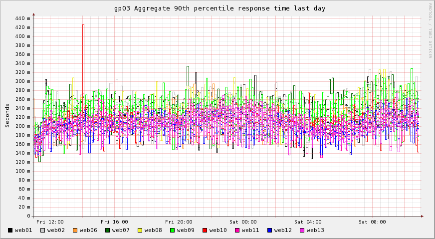
Would it mean anything to you :-) ? First time I was introduced to it I thought they were pointless since you couldn’t really see much. That was until I saw something like this
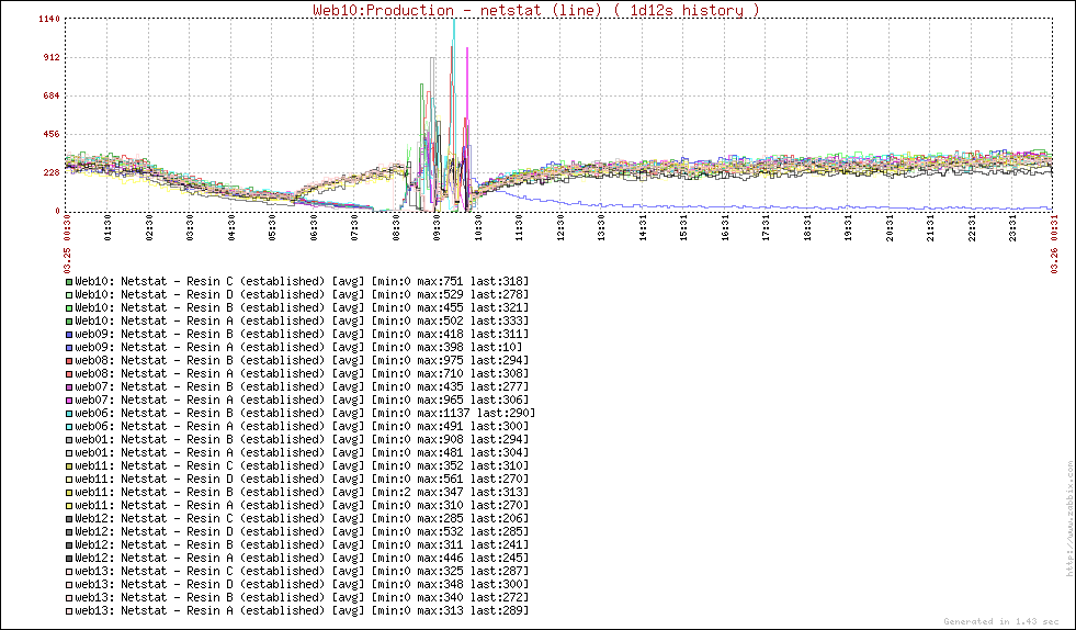
This was was post release. Can you spot something wrong :-) ? Obviously color scheme is somewhat off in the last graph which we later reworked (visible in the top graph). We then have another set of graphs where you can drill down per host aggregations as we are running multiple Resin instances on the same machine so you could find the misbehaving instance.
You can make these graphs pretty easily by using Ganglia’s custom report graphs. I will try and post some of the ones we use in next couple days.
For those wondering what is 90th percentile response time you can read my Monitoring your website performance via 90th percentile response time.